This is the running twelve month average world temperature, as measured by satellites, as reported by The National Space Science and Technology Center.
World temperature change in centigrade degrees.
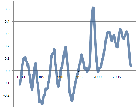
It goes up, it goes down. If there is any trend, the trend is less than the decade to decade fluctuations, and is not at all apocalyptic. This differs from other graphs you may have seen because it starts at the start of the satellite data and ends at the present, instead of starting in with a reconstruction of what might have been a cool year if we had accurate global data way back then, which we don’t, and ending in 2005, the most recent warm year.
Similarly for the amount of ocean ice
Again, it goes up, it goes down. If there is any trend, the trend is less than the decade to decade fluctuations, and is not at all apocalyptic. Again this differs from similar graphs you may have seen, which usually start in 1988 (a year with exceptionally large ice area) and end in 2007 (a year with exceptionally small ice area), and show only the Northern Hemisphere, where we recently had some exceptionally warm years, leaving out the Southern Hemisphere, where we recently had some exceptionally cold years.
As you can see, nothing much is happening – looks like the world is warming, but not enough to be noticeable – nor enough to be sure that it actually is warming.
Thus irrespective of the validity of anthropogenic global warming, the belief that apocalypse is upon us, that something urgent must be done, is religious, based on the feeling that we have sinned against Gaea and her wrath will come upon us, not based on any scientific evidence.
What is the base year for this chart? It would be helpful information to know when the 0 degree average change is from.
I am going to issue a more up to date chart shortly, the new one showing both the rolling twelve month average global temperature, and the seasonally adjusted global ice area anomaly.
Interesting chart and ideas that make sense. though the little religous thing you threw in at the end kind of throws alot of your credibility off. mainly because, the idea of global warming comes from scientific background not religous. also if were talking about the way the US looks at global warming the idea is supported by way more democrats than republicans. and on average the republicans are the religous ones. also using your logic you cant completely throw out the idea of global warming though in the next thirty to fourty years will we see if the idea of global warming is real, and by then it may be to late. and whether its real or not the changes that people say should be taken to counteract this global warming would not hurt humans. things like useing less oil and coal are not so extreme or even hard to do. but whether global warming happens or doesnt it never hurts to be prepared, especially when those preperations would be beneficial to the world and the people of the world
I have read most of the climategate emails. There is not one email that has a scientific outlook. These are the emails of a political, religious, and evangelical organization.
Some of the emails smell a lot worse than others, “Mike’s Nature trick to … hide the decline†but every single email, every single one that I read, smells at least a little funny. There is not one innocent email in the entire pile.
If you think there is one innocent email in the entire pile, show me that one email.
If you do an image search on Google for “average global temperature” you will see many graphs like yours. In fact, your graph is a small excerpt – the very end – of the other graphs, which usually go back to 1880. True, from your 25 year section of data, it is hard to conclude there is consistent warming. But when you look at the data going back to 1880, the warming trend is blindingly obvious. In fact, data going back that far suggest that warming is accelerating.
If, however, you look at the data going back to 1000AD, the cooling trend is blindingly obvious.